I’ve always kept very good records of all of my workouts. I’ve used a couple of different websites over the years to keep track of things. As part of the Triathlon Dominator package that I ordered, I could get all of my planned workouts automatically uploaded to a website called Training Peaks. So naturally, I started using this website to log everything.
I’m really impressed with the power of this site. I’m a stats and data geek, so I love to look at charts and graphs. Training Peaks goes above and beyond when it comes to this type of information.
Last week marked the half way point of my 36 week Ironman training plan. So I decided to take a look at some data from the first 18 weeks.
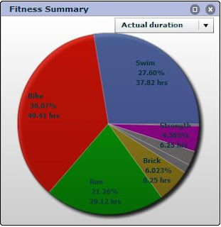
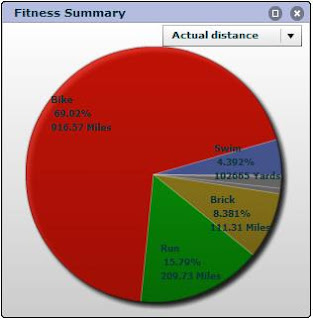
First, let’s just look at raw numbers.
Total training duration for the 18 weeks was 136.47 hours, which averages out to a little under 8 hours a week. This value will start to increase over the next few weeks as the workouts get longer.
Actual miles covered in the 18 weeks was 1328, which averages out to 73.8 miles per week.
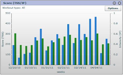
This next chart shows my Training Stress Score (TSS) and Intensity (IF).
TSS is a way of expressing the workload from a training session. It is a product of the workout’s intensity and duration. IF is basically how intense the workout was. So you can see that the TSS (blue) ramped up leading into my first race the second week of April, while the intensity remained fairly constant. Ideally, the TSS will be low and the IF will be high heading into all races.
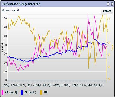
This last chart is Performance Management and has a lot going on.
All that you need to know from this is that the pink line (ATL) represents fatigue based on training loads, the blue line (CTL) represents fitness and the yellow line (TSB) represents how fresh I am.
The rate of fitness (blue line) increase is critical. A dramatic incline will likely lead to over training, so it’s good to see that mine has a more gradual grade. As you can see, my freshness (basically how good I’m feeling) is the yellow line and it dips into the negative from time to time. When it’s negative, fatigue is higher than fitness. When it’s positive, fitness is higher than fatigue. The goal is to have this number +10 or so (indicates ideal conditions for peak performance) a few days before my key races.
Another thing that I noticed is that after a very intense workout (pink line), my freshness (yellow line) drops over the next few days.
The shape of this chart is what’s important. Slow growth in CTL without too many huge spikes in ATL or TSB is what I’m shooting for over the season.
RECENT WORKOUTS:
4/21/11 Run – Aerobic Zone run (11.7 miles in 1:31:53)
4/21/11: Weights – Dry Land Strength circuit – 4 sets
4/22/11: Bike – High cadence intervals (21 miles in 1:00:00)
4/22/11: Swim – Steady Swim (2400 yd in 42:47)
4/23/11: Bike – Recovery Ride (49 miles in 2:43:34)
4/25/11 Run – VO2 max sets (4.67 miles in 34:17)
4/26/11: Bike – Power Sets (18 miles in 55:01)
4/26/11: Swim – Force Development (1600 yd in 34:58)


No comments yet.